


BRAND GUIDELINES
01
The client brief
Develop a new brand following a company buy out. The new owners wanted a fresh look and feel that was highly professional and wholly relevant to their industry and work.
02
The creative response
PO'Sh presented 3 strong concepts for the logo choice all based on the client feedback around his company brand.
The chosen concept has a technological feel, but also
communicates a message of environmental responsibility.
We wanted to modernise the existing brand by doing something completely different, yet wholly bespoke to Gas Data. We have successfully transformed this brand and given an innovative, future tech, friendly and highly professional identity.
03
The client response
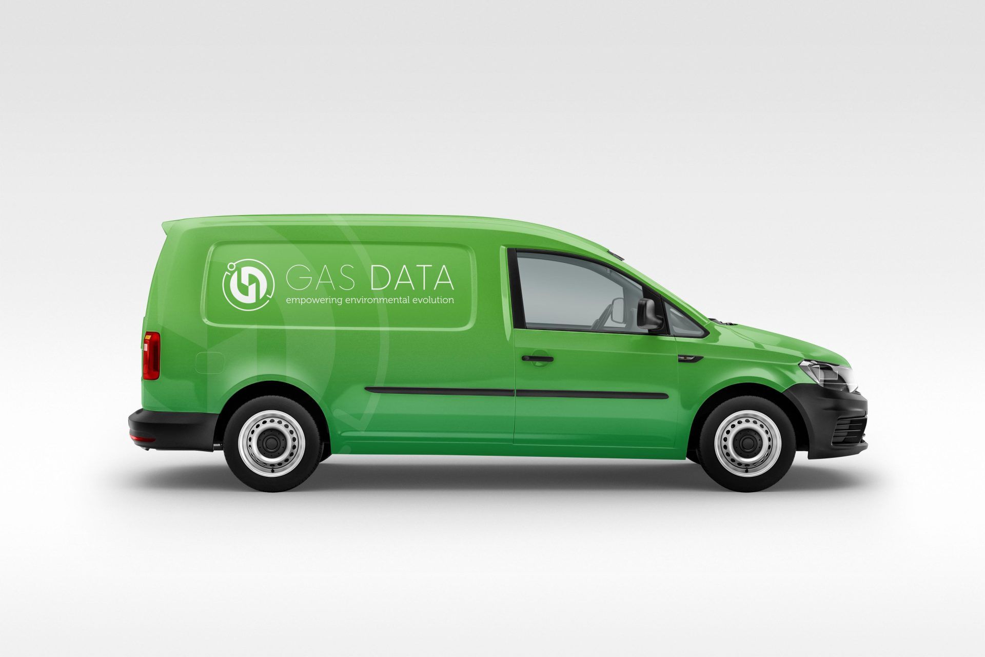
GAS DATA
Working it out
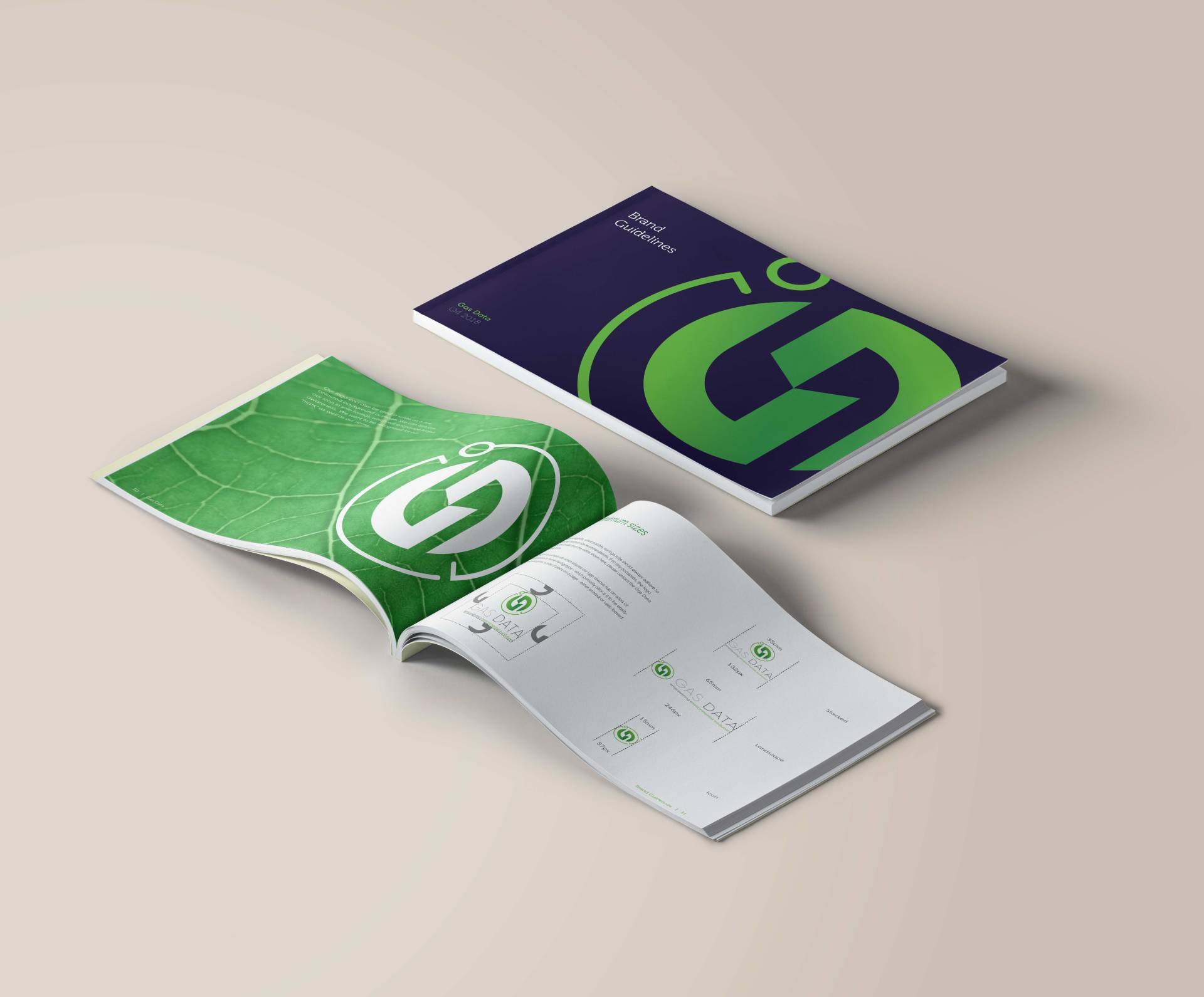
THE LOGO:
A clever design that pulls out a ‘G’ and ‘D’ and works as a strong motif communicating the idea of technology and green energy. It has an app-like feel, digital in nature. like a switch, which works perfectly to communicate the core service of extracting, analysing and providing access to data.
It's emblem will be synonymous with quality, trust, safety, reliability, innovation and green energies. We designed it to feel positively familiar and work sublimely on
digital platforms and on data dashboards where it will be seen most of the time.
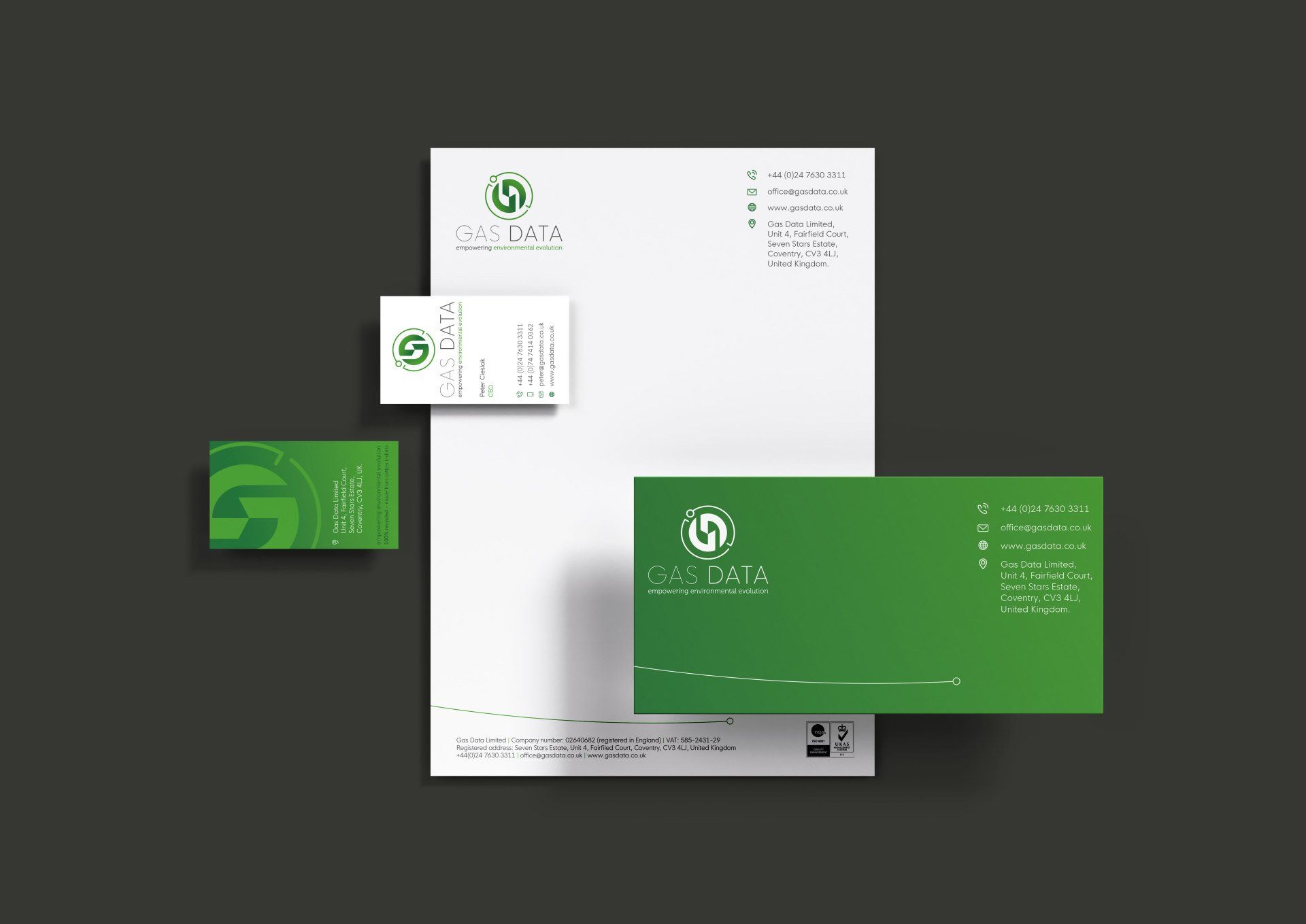
THE BRAND ELEMENTS
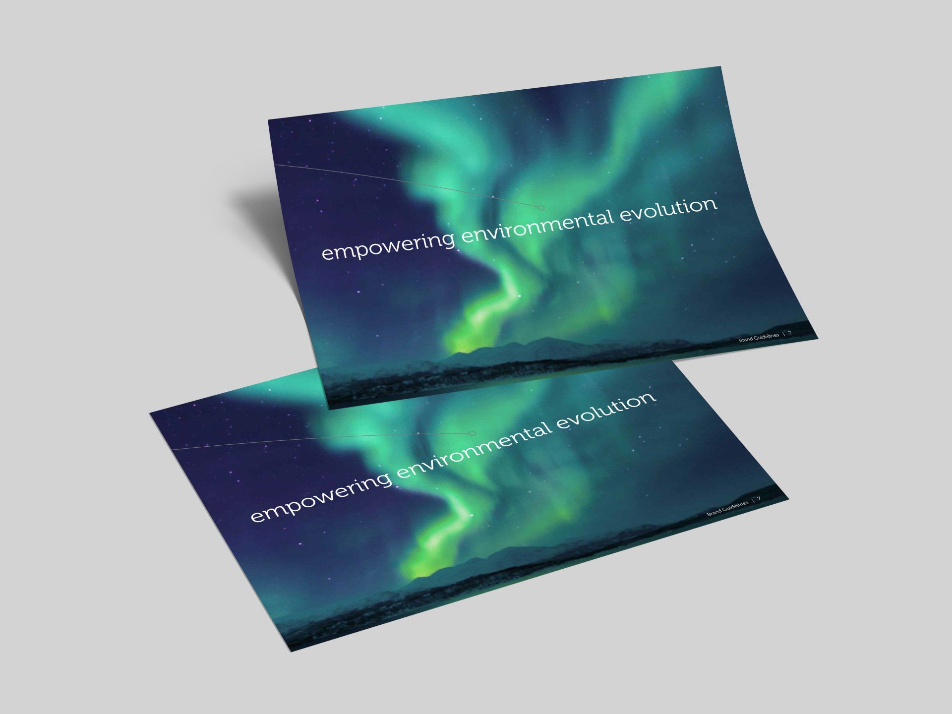
This brand is all about communicating future technology, it says we’re switched on in all the right ways, particularly when coupled with the new tagline of empowering environmental evolution. The colour scheme is purposely green and evokes thoughts of green energies at the core of the business.
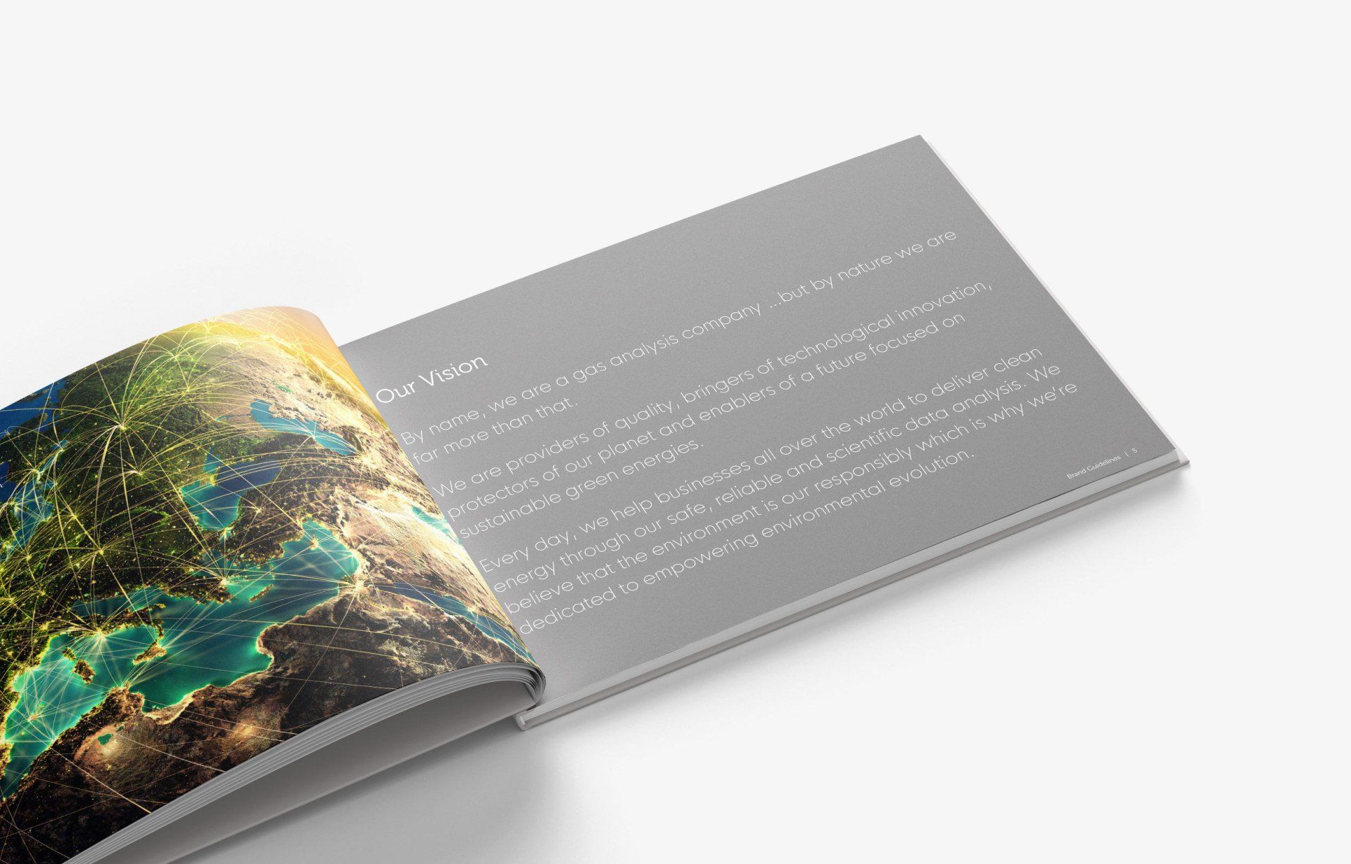
We created a comprehensive brand guidelines document and wrote the vision and values sections to help bring the brand essence alive.
The new brand communicates that Gas Data are technological innovators, protectors of our planet and enablers of a future focused on
sustainable green energies. Every day, they help businesses all over the world to deliver clean energy through their safe, reliable and scientific data analysis. We encourage and communicate, in our brand application, their
belief that the environment is a shared responsibility and that they are dedicated to empowering environmental evolution.
05
Did good things happen...
This young brand is already making big waves, with new and lucrative contracts in place with some of the main players on green energies.
As part of the brand ethos, marketing materials and all business practice will be wholly environmentally friendly too.
We are thrilled to work with such an environmentally aware business and look forward to bringing the brand to life further.